Gallery
Okdraw
Portugal
Credits
Images by Catarina Brites, Gonçalo Alves, Hugo Ferreira, Marco Santos, and Pedro Teixeira.
Architecture by Corpo Atelier.
Rendering Engine
3ds Max Interactive, Corona
Sources of Inspiration and References
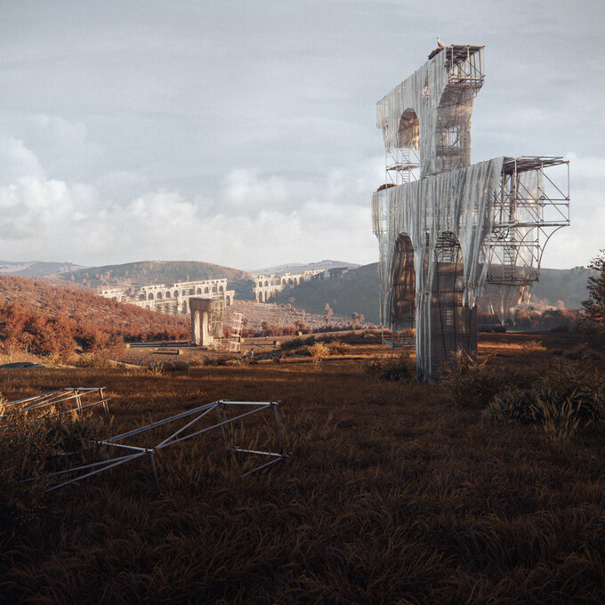
This project was conceived as a conceptual exhibition piece for the 2023 Architectural Biennale in Venice, Italy, to be presented through a combination of images and a physical model. The architects aimed to draw attention to the issue of water scarcity, particularly pronounced in the South of Portugal, specifically in Alentejo. They intended to highlight how this problem transcends environmental concerns, extending into financial and political domains.
The architectural concept was inspired by the ancient stone aqueducts found in Portugal, particularly one located in Alentejo. The architects designed a structure resembling these aqueducts in shape, enveloped in translucent plastic to become reminiscent of greenhouse plantation materials. This plastic cover symbolizes the abundance of water used in large-scale greenhouse plantations in Alentejo, often managed by international entities, while the local population and small-scale farmers faced inadequate access to water.
To capture the essence of the envisioned landscape, reference images were required to showcase the arid, yellowish, and dry appearance of Alentejo. These images helped visualize the desired desolation:
- https://www.vozdaplanicie.pt/images/202202241559175731.jpg
- https://herdademontedacal.pt/wp-content/uploads/2022/11/separador-paizagem-alentejo-e1668478896633.png
- https://thumbs.dreamstime.com/z/paisagem-seca-da-regi%C3%A3o-do-alentejo-105958432.jpg
- https://www.shutterstock.com/shutterstock/photos/1807467658/display_1500/stock-photo-a-herd-of-brown-cows-and-one-black-cow-eating-hay-on-the-dry-ground-a-cork-tree-stands-in-a-plain-1807467658.jpg
We wanted to convey the sense of abandonment and disrepair in the structure to underscore the water access issue. For this, we used as inspiration an opening shot from Federico Fellini's 1960 movie "La Dolce Vita," where an old aqueduct disintegrated in several ruins, with disconnected sections scattered across the landscape: https://static.rogerebert.com/redactor_assets/pictures/scanners/opening-shots-quiz-2-10-easy-pieces-2/e1.jpg
To better understand how to visually represent the structure and the plastic wrap, we recalled an image of a historic bridge being constructed in Oporto, Portugal, depicting a massive, unfinished, and unconnected structure. Additionally, we drew inspiration from the renowned artists Christo and Jeanne-Claude, whose work involved wrapping large areas, using images such as these for reference:
- https://pontesvida.files.wordpress.com/2016/10/1.jpg
- https://somethingcurated.com/wp-content/uploads/2021/09/dwqdc-1.jpeg
Regarding the overall visual style, we sought to emulate the captivating illustrations of Simon Stålenhag. We admire his adept control of black levels in the shadows to create vibrant yet muted imagery, like in this example:
https://conceptartworld.com/wp-content/uploads/2013/09/Simon_Stalenhag_scrapyard_sentry_1024.jpg
Video card
NVIDIA GeForce RTX
